Helping firms track the progress of their applications
Project background
The Financial Conduct Authority is a non-governmental regulator, responsible for advising the public and monitoring organisations that offer lending and finance. These can be large organisations like banks, or smaller lenders. Applications processing could take a year. FCA wanted to improve the customer experience by improving the application process, saving time and reducing calls to the contact centre.
My role
I led a small team of UX/UI, research and visual designers while managing business alignment from an internally-focused organisation, to an appreciation of user-focused solutions.
Challenge
Improve the user experience and help firms track the progress of applications submitted for approval to conduct financial activities.
Strategic goals
- Create better visibility of the application progress, but without revealing too much of the activities that take place in the background
- Help users become more knowledgeable and understanding of the application processing timeframes
- Improve ‘self serving’ – measurable reduction in contact centre calls
Design goals
- Logical task-orientated user journeys based on different users’ needs
- Clear sign posting and step-by-step helpful information, to reduce confusion and frustration while filling applications
- Clear wording in natural language, rather than policy language
- Be inclusive to different user groups and accessibility considerations
Plan
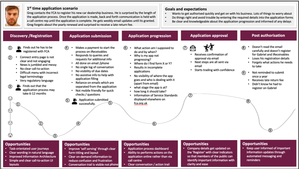
I ran a series of Jobs-To-Be-Done (JTBD) style interviews with financial lending firms reps. who just went through an application process with the FCA in order to understand their pain-points and needs. Our team then used this information to build a journey map of the application process.

We identified the specific needs of different user groups by focusing on task-related activates (Jobs) such as in-application chat, on-time alerts, and email notifications.

The journey map and research data were used to facilitate a Design Thinking workshop with FCA Case Managers and Contact Centre Associates, to get an understanding of their unique requirements.

Using low-fidelity wireframes we conducted usability testing, and card sorting to help understand pain-points that can be clarified with timely messaging. This was important because for this service to be efficient, the application had to ‘speak’ the language that Contact Centre Associates use to communicate with their clients, not the previously used business language.
We proceeded to design a dashboard for a Case Manager, a person who would manage several firms’ applications, and a dashboard for an Applicant, who manages their own firm’s application.


Outcome
The product was delivered successfully and on time. Once we made the case for user-centred design, we became involved with additional FCA projects, which led to the redesign of ‘FCA Register’, another important public facing service.
Testimonial on the delivery of FCA Connect:
“Thank you very much for the demo yesterday which gave me the confidence I need as well as being very impressed by the UI and the functionality we can now provide to our customers. Feedback has been universally positive with many people excited at the future potential to further extend the site.” – Steve, FCA Product owner